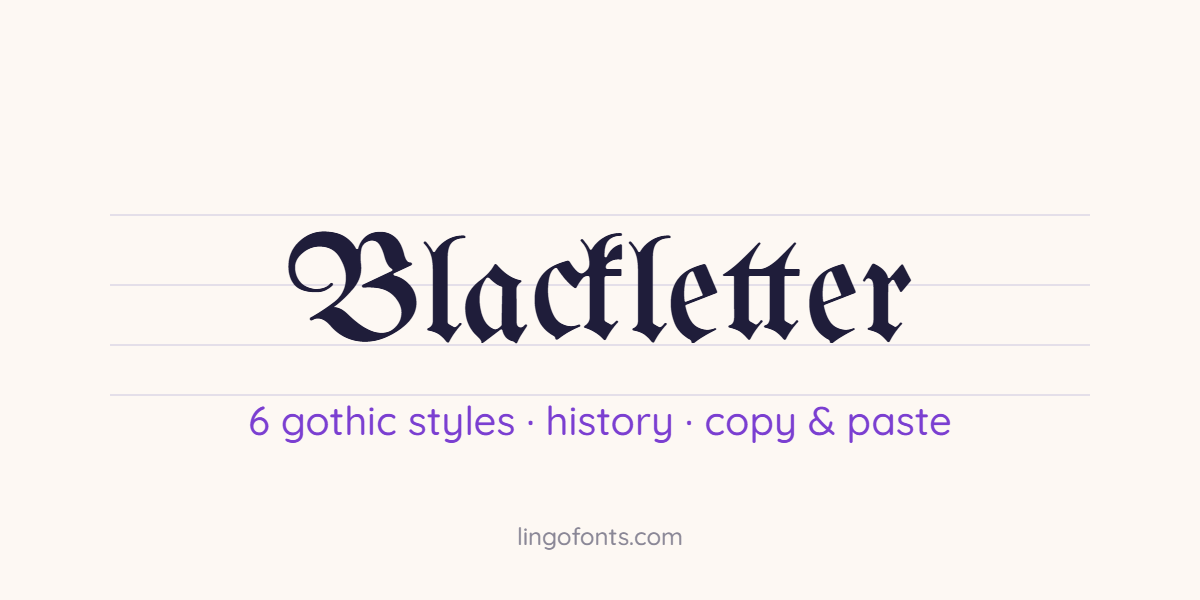
A blackletter font is a typeface based on the Gothic scripts that scribes wrote across Western Europe from about 1150 until the 1600s. Its letters are tall, narrow and built from straight, broken strokes, which gives the page the dark, dense texture the name describes. Today people also call it Gothic, Old English or Fraktur, and you see it on newspaper mastheads, beer labels, tattoos and metal band logos. This guide explains the six historical blackletter styles, how to tell them apart, the history behind them, which free blackletter fonts to use in design software, and how to copy and paste blackletter text into apps that do not let you change fonts.
Quick answer: for a logo, poster or document, install a real blackletter font such as UnifrakturMaguntia or Pirata One. For an Instagram bio, Discord name or TikTok caption, use Unicode Fraktur letters like 𝔅𝔩𝔞𝔠𝔨𝔩𝔢𝔱𝔱𝔢𝔯 or 𝕭𝖑𝖆𝖈𝖐𝖑𝖊𝖙𝖙𝖊𝖗, which paste anywhere without a font install. You can make them with the Calligraphy Font Generator.
What Is a Blackletter Font?
Blackletter is a family of scripts, not a single font. Medieval scribes wrote it with a broad edged pen held at a fixed angle, so every stroke came out either thick or hairline thin. Round curves were replaced by angled breaks, letters sat close together, and a finished page looked like a fence of dark vertical strokes. The German name Fraktur comes from the Latin fractus, meaning broken, which describes those angular breaks.
Blackletter grew out of the rounder Carolingian minuscule during the twelfth century. Compressed letters fit more words on each sheet of costly parchment, which is one common explanation for why the style spread so widely. Its decline was slow: Danish printing used blackletter until around 1875, and German printing kept it until the 1940s.
Every blackletter font you download today imitates one of those handwritten styles. Knowing which one it copies helps you pick a font that fits your project, because a heavy Fraktur says something very different from a calm, upright Textura.
Blackletter, Gothic, Old English or Fraktur: Which Name Is Right?
Font menus use these names loosely, and that causes confusion when you search for a font. Here is what each term actually means.
| Term | What it really means | When to use it |
|---|---|---|
| Blackletter | The umbrella term typographers use for the whole family of broken scripts | The most accurate general name |
| Gothic script | The same family. Renaissance writers used Gothic as a label for medieval styles they saw as crude | Fine in everyday use, but note that American type names such as Franklin Gothic use Gothic to mean sans serif |
| Old English | A popular name, especially in the US, for any blackletter font | Misleading, because the Old English language is centuries older than blackletter |
| Fraktur | One specific German style from the 1500s with curling capitals | Only for that style |
| Textura | The tallest, most formal style, used in the first printed Bible | Only for that style |
The 6 Blackletter Styles and How to Recognise Them
Paleographers sort handwritten blackletter into a few main forms, and printers later turned each one into metal type. The table covers the six you are most likely to meet in fonts and old books.
| Style | Main period | Region | How to spot it |
|---|---|---|---|
| Textualis (Textura) | Peak in the 14th and 15th centuries | Northern Europe | The tallest and narrowest form. Lowercase i, m, n and u are built from almost identical upright strokes, so words can be hard to read |
| Rotunda | From the 13th century | Italy and Spain | Rounder, wider and less angular. Used at the University of Bologna for academic books |
| Cursiva | From the 14th century | Across Europe | A faster handwriting form for letters and records, with looped ascenders and no single standard shape |
| Hybrida (Bastarda) | From the early 15th century | France, Burgundy and Germany | A mix of formal Textualis letters and quicker Cursiva shapes, often used in luxury books |
| Schwabacher | About 1480 to 1530 in print | Germany | Heavy and rounded. The lowercase o is round on both sides |
| Fraktur | Mid 1500s until 1941 | German speaking lands | The lowercase o is angular on the left and round on the right. Capitals have curling strokes often called elephant trunks |
A quick test: look at the lowercase o. If both sides are pointed and the letters look like a picket fence, it is Textura. If both sides are round, it is Schwabacher or Rotunda. If the left side is pointed and the right side is curved, it is Fraktur. Most Unicode blackletter text, including 𝔊𝔬𝔱𝔥𝔦𝔠, is modelled on Fraktur.
A Short History of the Blackletter Font
Monasteries and universities, about 1150 to 1450
For three centuries blackletter was simply how books were written. Monks copied Bibles and prayer books in Textura, universities copied law and medical texts in Rotunda, and clerks wrote everyday records in Cursiva.
Gutenberg and the first printed books
When Johannes Gutenberg began printing with movable type in Mainz, he copied the script readers already trusted. His 42 line Bible, finished around 1455, was set in a Textura type. Because the first printers imitated manuscripts, blackletter became the standard printing type across northern Europe, while Italian printers soon moved to the Roman letters we read today.
Fraktur and the Antiqua debate
Emperor Maximilian I, who reigned from 1493 to 1519, had a new typeface cut for a series of prestige books, and that design grew into Fraktur. During the 1500s Fraktur overtook Schwabacher and became the national typeface of German printing. For the next four centuries German writers argued over whether to keep Fraktur or switch to Roman type, known in German as Antiqua.
The 1941 ban
The argument ended abruptly. On 3 January 1941 Martin Bormann issued an edict on behalf of the Nazi party that abandoned blackletter, falsely claiming the letters were Jewish in origin. The practical reason was that Roman type was easier to read and print in occupied countries. From the following school year only Roman letters were taught, and blackletter never returned to everyday German print. That history matters because many people wrongly assume the Nazis promoted blackletter to the end.
Blackletter today
Blackletter survives as a display style that signals tradition, authority or rebellion depending on context. The New York Times and The Washington Post still use blackletter style nameplates, German breweries use it on beer labels, universities print it on diplomas, and heavy metal bands, tattoo artists and streetwear brands use it for an edgy look.
Blackletter Text to Copy and Paste
Social apps do not let you choose a font, so the trick is to use Unicode characters that already look like blackletter. The Unicode Mathematical Alphanumeric Symbols block includes two full blackletter alphabets, Fraktur and Bold Fraktur. Copy any line below.
| Plain text | Fraktur | Bold Fraktur |
|---|---|---|
| Blackletter | 𝔅𝔩𝔞𝔠𝔨𝔩𝔢𝔱𝔱𝔢𝔯 | 𝕭𝖑𝖆𝖈𝖐𝖑𝖊𝖙𝖙𝖊𝖗 |
| Old English | 𝔒𝔩𝔡 𝔈𝔫𝔤𝔩𝔦𝔰𝔥 | 𝕺𝖑𝖉 𝕰𝖓𝖌𝖑𝖎𝖘𝖍 |
| Happy Birthday | ℌ𝔞𝔭𝔭𝔶 𝔅𝔦𝔯𝔱𝔥𝔡𝔞𝔶 | 𝕳𝖆𝖕𝖕𝖞 𝕭𝖎𝖗𝖙𝖍𝖉𝖆𝖞 |
| Gothic Vibes | 𝔊𝔬𝔱𝔥𝔦𝔠 𝔙𝔦𝔟𝔢𝔰 | 𝕲𝖔𝖙𝖍𝖎𝖈 𝖁𝖎𝖇𝖊𝖘 |
| Stay Wild | 𝔖𝔱𝔞𝔶 𝔚𝔦𝔩𝔡 | 𝕾𝖙𝖆𝖞 𝖂𝖎𝖑𝖉 |
| The Last Chapter | 𝔗𝔥𝔢 𝔏𝔞𝔰𝔱 ℭ𝔥𝔞𝔭𝔱𝔢𝔯 | 𝕿𝖍𝖊 𝕷𝖆𝖘𝖙 𝕮𝖍𝖆𝖕𝖙𝖊𝖗 |
To convert your own name or caption, type it into the calligraphy font generator and copy the Gothic Fraktur style. For every letter from A to Z in both weights, see the calligraphy alphabet reference.
Why Five Fraktur Capitals Look Different
Look closely at ℭ𝔥𝔞𝔭𝔱𝔢𝔯 or ℌ𝔞𝔭𝔭𝔶 and the capital may sit at a slightly different size or weight from the rest of the word. That is not a bug in your phone. When Unicode added the Mathematical Fraktur alphabet in 2001, five capitals already existed in the older Letterlike Symbols block because mathematicians used them, for example ℜ and ℑ for the real and imaginary parts of a complex number. Unicode left those slots empty in the new alphabet and pointed to the existing characters instead.
| Letter | Character | Code point |
|---|---|---|
| C | ℭ | U+212D |
| H | ℌ | U+210C |
| I | ℑ | U+2111 |
| R | ℜ | U+211C |
| Z | ℨ | U+2128 |
Because those five come from a different block, some fonts draw them in a different style. Bold Fraktur has no gaps, so if your name starts with C, H, I, R or Z, the bold version looks more even. The W3C Fraktur character table lists every code point if you want to check one.
Two more limits are worth knowing. Unicode has no Fraktur digits, so numbers always stay plain, and accented letters such as é or ü are not included, so they also stay plain.
Where Blackletter Works and Where It Does Not
Blackletter is a display style. It earns attention in a few words and becomes tiring after a sentence. Use it here:
- Short headings, names and initials, such as a display name or the first line of a bio
- Logos, labels and merchandise where a single word carries the brand
- Event titles for Halloween, Oktoberfest, gigs or gaming tournaments
- Tattoo and lettering mockups before you visit an artist
- Certificates and formal titles, paired with a plain font for the details
Avoid it in these places:
- Long captions and body text, which become hard to read on a small screen
- Usernames and handles, because search cannot match 𝔊𝔬𝔱𝔥𝔦𝔠 to the word Gothic
- Anything that must be accessible. Unicode intends these letters for maths, so many screen readers read them as symbols or skip them. Our guide on how search engines and AI read Unicode text explains why
- Older devices that lack the characters, where text shows as empty boxes. See why fancy text looks like boxes
Context also matters. Blackletter has almost nine centuries of history that has nothing to do with extremism, yet a few hate groups still borrow it. Pair it with clearly unrelated imagery and it reads as tradition or rock, not politics.
Free Blackletter Fonts for Design Projects
For Canva, Word, Photoshop or a website, use a real blackletter font instead of Unicode letters. Real fonts include numbers, punctuation and accents, and they stay readable to screen readers. All of the fonts below are free and open source on Google Fonts; check the license on each font page before commercial use.
| Font | Style it follows | Best for |
|---|---|---|
| UnifrakturMaguntia | Classic German Fraktur | Authentic old print, certificates, beer labels |
| UnifrakturCook | Heavy Fraktur | Bold headlines and posters |
| Pirata One | Simplified modern blackletter | Logos where readability matters |
| Grenze Gotisch | Modern blackletter with many weights | Brand systems that need light and bold versions |
| Texturina | Textura inspired, made for readability | Longer headings and book covers |
| New Rocker | Rock style blackletter | Band names and merchandise |
| Metal Mania | Spiky heavy metal display | Halloween and metal designs |
| Germania One | Condensed, simplified Gothic | Signage and labels |
If you mostly want ornate letters for invitations rather than a Gothic look, our list of calligraphy fonts for wedding invitations covers script styles instead.
How to Write Blackletter by Hand
Blackletter is one of the easiest calligraphy hands to start with, because Textura is built almost entirely from straight strokes. You need a broad edged tool, such as a calligraphy fountain pen or a chisel tip marker, and lined paper.
- Hold the pen so the flat edge sits at roughly 30 to 40 degrees to the writing line, and keep that angle the whole time.
- Practise the basic upright stroke: a short diamond at the top, a straight downstroke, and a short diamond at the bottom.
- Build letters such as i, n, m and u from that stroke, keeping the white gap between strokes about as wide as the strokes themselves.
- Make the lowercase body about five pen widths tall so the letters look dense rather than spindly.
- Add capitals last, since they are the most decorative part and the hardest to keep consistent.
If you are new to lettering, start with our hand lettering for beginners guide, and read cursive vs calligraphy to see where blackletter fits among other calligraphy styles.
Frequently Asked Questions
What is the blackletter font called?
Blackletter is also called Gothic script, Old English or broken script. Fraktur and Textura are names for two specific blackletter styles rather than for the whole family.
Is Old English font the same as blackletter?
Yes. Old English is a popular name, mostly in the US, for blackletter fonts. It is technically misleading, because the Old English language was written centuries before blackletter appeared.
How do I get a blackletter font on Instagram or TikTok?
Use Unicode Fraktur letters. Type your text into a calligraphy or fancy text generator, copy the Fraktur or Bold Fraktur version, and paste it into your name, bio or caption. Keep your username in plain letters so people can search for you.
Why do numbers not change into blackletter?
Unicode has no Fraktur digits, so numbers stay in the normal style. Accented letters are missing too. For full blackletter numbers and accents, use a real blackletter font in a design app.
Is blackletter a Nazi font?
No. Blackletter was used for about 800 years before the Nazi era, and the Nazi party actually banned it in January 1941 in favour of Roman type. Some extremist groups still borrow it, so pay attention to the imagery you pair it with.
What is the best free blackletter font?
UnifrakturMaguntia is the best free choice for an authentic Fraktur look. Pirata One is easier to read for logos, and Grenze Gotisch is useful when you need several weights. All three are free on Google Fonts.
Is Gothic font the same as blackletter?
Usually yes, Gothic font means blackletter in everyday use. The exception is American type naming, where fonts such as Franklin Gothic and Century Gothic use Gothic to mean sans serif.
Sources: Unicode Mathematical Alphanumeric Symbols chart, Unicode Letterlike Symbols chart, W3C Fraktur character table and Google Fonts.