
Hand lettering for beginners starts with one simple idea: you are not writing words, you are drawing them. Once you understand that, plus one rule about thick and thin strokes, you can create signs, cards and journal headers that look hand-made in the best way. This guide walks you through seven steps, from the supplies you actually need to your first finished lettering piece.
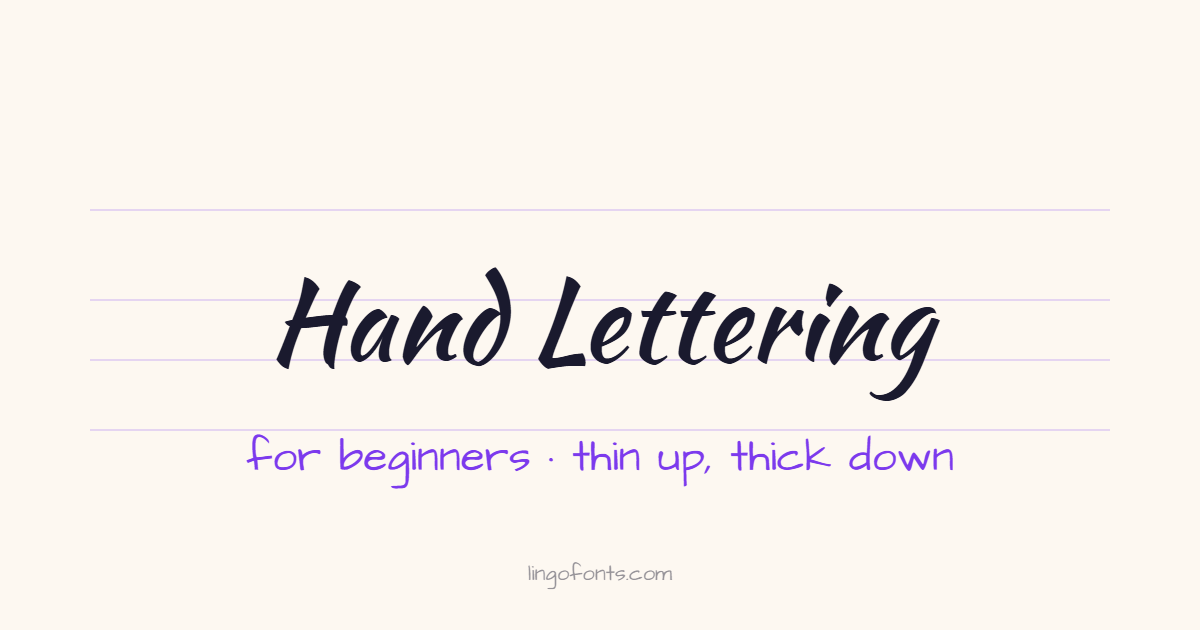
What Is Hand Lettering?
Hand lettering is the art of drawing letters. Each letter is sketched, adjusted and finished for one specific word or phrase, the way an illustrator works on a drawing. Lettering artist Joseph Alessio puts the distinction clearly in his Smashing Magazine article on type and lettering: lettering is based on draftsmanship, while calligraphy is based on penmanship.
| Hand lettering | Calligraphy | Typography | |
|---|---|---|---|
| What it is | Drawing letters | Writing letters | Arranging ready-made typefaces |
| How letters are made | Sketched, refined and filled in, often stroke by stroke | Written with a set sequence of pen strokes | Chosen from a font and set by software |
| Each letter is… | Custom-made for one piece | Made in one pass with a pen | Reused every time |
| Typical uses | Signs, posters, cards, logos, journals | Invitations, certificates, formal titles | Books, websites, documents |
The lines blur in practice. Modern “brush lettering” borrows calligraphy’s thick-and-thin strokes, which is why the two are so often confused. If you want the full story of the pen-based tradition, read our guide to cursive vs. calligraphy.
Hand Lettering for Beginners: What You Need
You do not need an expensive kit. Start with these, and add tools only when you know you enjoy it:
- A pencil and eraser. Every good lettering piece starts as a pencil sketch. A regular HB pencil is fine.
- Smooth paper. Rough or very thin paper makes brush pens fray and ink bleed. Marker paper or mixed-media paper works well; for pure practice, smooth printer paper is acceptable with pencils and fineliners.
- A small, firm brush pen. This is the easiest way to get thick and thin strokes. Small firm tips such as the Tombow Fudenosuke (hard tip) are forgiving for beginners.
- A larger flexible brush pen (later). Pens like the Tombow Dual Brush Pen create bigger, bolder letters, but need more pressure control.
- A fineliner. A fine-tip pen such as a Sakura Pigma Micron is useful for outlines, details and simple monoline letters.
- A ruler. For drawing straight guidelines before you letter.
Step 1: Learn Letter Anatomy and Draw Guidelines
Before you draw a single letter, draw four light pencil lines. These guidelines keep your letters the same size and sitting on the same level:
- Baseline: the line all letters sit on.
- Waistline (x-height line): the top of lowercase letters like a, c, e and x. The distance between the baseline and waistline is the x-height.
- Ascender line: the top of tall letters like b, d, h, k and l, and usually of capitals.
- Descender line: the bottom of letters that drop below the baseline, like g, p, q and y.
A comfortable starting ratio is to make the x-height about the same as the space for ascenders and descenders. Once you are confident, you can break the rules on purpose, which is exactly how bounce lettering works (step 5).
Step 2: Master the Basic Strokes
Almost all brush lettering follows one rule: thin upstrokes, thick downstrokes. Press down as the pen moves toward you, and lighten the pressure as it moves away. Holding the pen at roughly a 45-degree angle to the paper lets the side of the brush tip create the thick strokes.
Before letters, practice the basic strokes that letters are built from:
- Thin upstroke: a light diagonal line moving up.
- Thick downstroke: a heavy straight line moving down.
- Overturn: thin on the way up, curving over, thick on the way down (the start of n and m).
- Underturn: thick on the way down, curving under, thin on the way up (the end of u).
- Compound curve: an overturn and underturn joined together.
- Oval: thick on the left side, thin on the right (the body of a, d, g and o).
- Ascending loop: the tall loop of b, h, k and l.
- Descending loop: the lower loop of g, j and y.
Fill a page with each stroke. It feels slow, but these eight shapes make up nearly the whole lowercase alphabet, so every minute here pays off later.
Step 3: Draw Letters Stroke by Stroke
Here is the biggest difference from everyday cursive: in brush lettering you lift the pen between strokes. The letter “a” is an oval plus an underturn, drawn as two separate movements. Lifting the pen lets you reset your hand and control the pressure of each stroke.
- Go slowly. Speed creates wobbly lines and uneven thickness.
- Keep your downstrokes parallel. Consistent slant matters more than perfect individual letters.
- Practice lowercase first, then capitals, then numbers.
- Connect letters by lining up the exit stroke of one letter with the entrance stroke of the next.
Step 4: Try Faux Calligraphy (No Brush Pen Needed)
Faux calligraphy is the fastest way to get a lettered look with any pen or pencil:
- Write your word in simple cursive, with a little extra space between letters.
- Find every downstroke, the parts where your pen moved down.
- Draw a second line next to each downstroke.
- Fill in the gap between the two lines.
This also trains your eye. After a few words, you will automatically know where the weight belongs, which makes the switch to a brush pen much easier.
Step 5: Learn Three Core Lettering Styles
- Script: flowing, connected letters with thick and thin strokes. Great for a single focus word.
- Sans serif: simple, upright letters with even thickness, often drawn as outlines and filled in. Easy to read and great for supporting words.
- Serif: letters with small feet (serifs) at the ends of strokes, giving a classic, vintage-sign feel.
Once these feel comfortable, try bounce lettering: let some letters dip below the baseline or rise above the waistline on purpose. Done consistently, it gives script a playful, energetic rhythm.
Step 6: Compose Your First Lettering Piece
A lettering piece is more than nice letters; it is a small layout. Use this process for a quote, a sign or a card:
- Pick the key words. Decide which one or two words matter most. These get the biggest, most decorative style.
- Choose two styles at most. For example, script for key words and sans serif for the rest. More styles quickly look messy.
- Sketch the layout in pencil. Draw rough boxes for each word first, then letters inside them. Adjust until the shape feels balanced.
- Refine and ink. Go over your best pencil lines with a brush pen or fineliner.
- Erase the pencil once the ink is completely dry, then add small details like shadows or flourishes.
Step 7: Take Your Lettering Digital
When you want to use your lettering on social media, stickers or printed products, you have a few options:
- Scan or photograph your work in good daylight, then increase the contrast so the paper turns white.
- Letter on a tablet. Drawing apps with pressure-sensitive brushes, such as Procreate on iPad, mimic brush pens and let you undo mistakes.
- Preview styles before you draw. Our free hand lettering generator lets you type a phrase and compare 27 brush, marker, retro sign and chalk fonts. It is a quick way to plan a layout, choose a style to practice, or download a transparent PNG when you need a design fast.
Common Beginner Mistakes to Avoid
Most problems in hand lettering for beginners come from a handful of habits, and all of them are easy to fix:
- Skipping the drills. Jumping straight to quotes makes progress slower, not faster.
- Pressing on upstrokes. Thick upstrokes are the most common reason brush lettering looks “off”.
- No guidelines. Letters drift up and down and change size without them.
- Rushing. Lettering is drawn slowly; speed comes later on its own.
- Using rough paper with brush pens. It frays the tip and ruins the pen early.
- Too many styles in one piece. Two styles with clear contrast always beat five.
A Simple 4-Week Practice Plan
This plan keeps hand lettering for beginners manageable: one focus per week and 15 to 20 minutes of practice a day.
| Week | Focus | Daily practice (15–20 min) |
|---|---|---|
| 1 | Basic strokes | Fill one page of each basic stroke; finish with faux calligraphy words |
| 2 | Lowercase letters | Practice a–z stroke by stroke with guidelines; repeat difficult letters |
| 3 | Words and capitals | Write short words, connect letters, practice capitals and numbers |
| 4 | Compositions | Plan and finish one small piece: a quote, a name card or a journal header |
Keep your first page from week one. Comparing it with week four is the best motivation there is.
Frequently Asked Questions
Is hand lettering hard to learn?
No. The basics, thin upstrokes and thick downstrokes, can be learned in a few weeks of short daily practice. Your first letters will look shaky, which is normal. Consistency comes from repetition, not talent.
Do I need a brush pen to start hand lettering?
No. You can start with a pencil and paper, or use faux calligraphy: write a word with any pen, then thicken every downstroke by hand. A brush pen makes the thick-and-thin effect faster, so most people buy one once they enjoy the basics.
What is the best brush pen for beginners?
A small, firm-tip brush pen is usually easiest to control, because it forgives uneven pressure. The Tombow Fudenosuke hard tip is a popular choice. Larger, more flexible pens like the Tombow Dual Brush Pen are great for bigger, bolder letters once your pressure control improves.
Is hand lettering the same as calligraphy?
No. Calligraphy is writing letters with a set sequence of pen strokes. Hand lettering is drawing letters, often building them up, refining their shapes and arranging them as a composition. Many letterers use calligraphy-style strokes, which is why the two are often confused.
How long should I practice hand lettering each day?
Fifteen to twenty minutes a day is enough to build muscle memory. Short, regular sessions work better than one long session a week, because the hand movements need repetition to become automatic.
Start Hand Lettering Today
Grab a pencil, draw your guidelines and fill one page with upstrokes and downstrokes. The best hand lettering for beginners advice really is that simple: start small and practice a little every day. When you want inspiration or a quick finished design, open the hand lettering generator and try your phrase in 27 lettering styles, or explore the calligraphy font generator for elegant formal scripts.