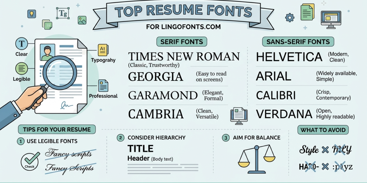
Resume fonts aren’t just aesthetic — it affects whether an Applicant Tracking System (ATS) can actually read your qualifications, and whether a recruiter finishes reading before their attention runs out. Here’s what the current data actually says, not just conventional wisdom.
What Font Size Should I Use on My Resume?
- Body text: 10–12pt — small enough to fit content, large enough to stay readable for both humans and ATS software
- Section headings: 14–16pt, enough contrast to break up the page without overwhelming it
- Your name: 18–22pt, the one place it’s fine to stand out
If your resume feels cramped, resist the urge to shrink the font below 10pt to fit more in — tighten your wording or margins instead. A resume that’s technically one page but painful to read loses more than one that runs slightly longer.
Best Resume Fonts That Actually Get Noticed
“Noticed” and “ATS-safe” aren’t in tension — the fonts that parse most reliably also tend to be the ones recruiters find easiest to skim. Reliable choices include:
- Calibri
- Garamond
- Cambria
- Helvetica
- Georgia
- Arial
- Lato
- Roboto
- Palatino
These share common traits: clean, standard character shapes; no unusual spacing or connected letterforms; and wide support across the parsing engines used by major ATS vendors like Workday, Greenhouse, Lever, and iCIMS. Sticking to one font family throughout the document, and exporting as PDF unless a job posting specifically requests DOCX, matters just as much as the specific font you pick.
Can the Wrong Font Get Your Resume Rejected?
Not automatically — but the real risk is easy to misunderstand. A 2025 Enhancv survey of recruiters found 92% said their ATS doesn’t auto-reject resumes purely for formatting or font choice, and only 8% reported using content-based auto-rejection at all. So no, picking Georgia over Arial won’t get you instantly filtered out.
The actual danger is parsing failure, not rejection: certain fonts get misread by ATS software, turning your carefully written experience into garbled text or missing keywords — which can hurt your ranking just as effectively as a direct rejection would, just less visibly. The clearest offenders:
- Script and cursive fonts (Brush Script, Lucida Handwriting) — connected letterforms are often misread as symbols rather than text
- Decorative fonts (Comic Sans, Papyrus, Impact) — unprofessional to human readers and unreliable for parsing
- Condensed or narrow fonts — can cause character overlap that makes text unreadable to scanning software
- Fonts with visual effects (shadows, outlines, 3D) — ATS systems generally can’t process these at all
The practical takeaway: the risk isn’t a font rejecting your resume outright, it’s a font quietly costing you visibility you never find out about. Sticking to well-tested resume fonts avoids the issue entirely.
How to Check If Your Resume Font Is ATS-Safe
You don’t need special software to sanity-check your resume fonts before submitting. Save your resume as a plain-text file (.txt) or copy the text into a basic text editor. If your name, dates, and bullet points come through cleanly and in the right order, an ATS will likely read them the same way. If you see missing characters, jumbled spacing, or entire sections out of order, that’s a sign your font or layout choices are causing parsing problems — usually solved by switching to one of the standard fonts above rather than reformatting the whole document.
It’s also worth testing across formats: export the same resume as both PDF and DOCX, since some older ATS platforms still handle one format more reliably than the other. When a job posting specifies a format, always use exactly that one — it’s a strong signal about which parsing engine is on the other end.
None of LingoFonts’ generators are meant for resume body text — our Unicode styles aren’t machine-readable at all, and our real fonts are decorative rather than standard corporate typefaces. If you want a small stylized accent for just your name or a signature line, see our guide on using cursive on a resume for what actually works there.